Tuesday 30 December 2014

Drafting and Planning: Contents page-another draft!

I'm so happy with this contents page! I put so much effort into it and I think it looks fabulous! I tried to take inspiration from NME and Q contents pages while putting in my own ideas and flairs. I kept in mind it's a 'monthly' magazine and also remembered the charts column on the right! I took some of the inspiration from the last contents page draft:


But here's the new draft!


By looking into a lot of magazines, I noticed when I first try to make this new draft, I made all the text too bold, and most magazines-if not all-use a balance of bold and more delicate fonts, hence the use of Times New Roman under each subheading. I made it more obvious that the numbers on each photo is relating to the page number, and I highlighted the corresponding page numbers within each subsection too to make it more obvious.
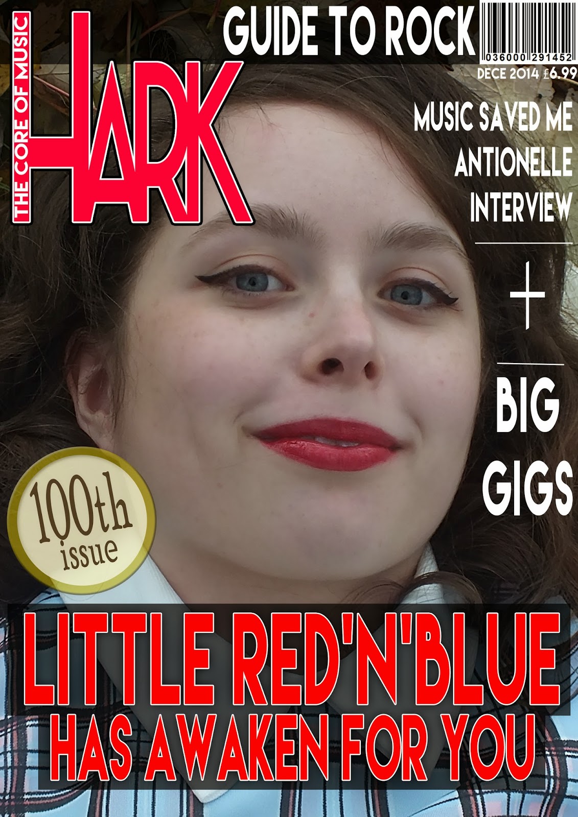
You may or may not have noticed that Jordan wasn't originally within the photo with the group of girls in. This is because I hadn't enough room for him in a separate space, so I had the genius idea of using the magic wand to take out the background and shuffled Jordan in at the back with the girl group! I had this idea before from when I originally took the photos, but actually looking at it now, I really like the addition of him in the photo!  I made the secondary photos black and white so I wont they wont take too much attention away from the main image. I even put in a face book and twitter logo as well as the date of the issue faded within the main image! I also think there's much more cohesion within the entire page now with the use of red, white and black!
I'm so very pleased with this contents page but must make sure I make the front cover and double page spread match it when officially making them!
In terms of improvements, I think there's a few grammar mistakes and I just realised there isn't a page number! Most contents pages are page 3, so I'll make sure that I count the pages accurately. I think there is more I could do to it though. It still feels a little incomplete; I think there should be more colour somewhere in the layout to add more substance. But so far it looks brilliant!

Friday 26 December 2014

Drafting and Planning: Front cover

I experimented more with the layout and colours of the front cover of HARK magazine.


I quite like the white background here, since it links more to the basic conventions of NME magazine. But I'm not sure if it'll match the other images in the contents page and double page spread that well, I see a lack of cohesion throughout the article if I use this element of white, unless I use white in all the other pages too. Anyway, I went into a lot of effort in the part and taking them photos, so instead of getting rid of the forest completely, perhaps I could edit the trees to make it look more like a 'music magazine' (rather than a gardening magazine like here) instead and through that, it could tell more of a story about the cover star.

I used more black with the cover lines to give it a more 'rock' look as well as to compliment well with the white background. I used red with the main cover line again to build a bridge between the cover star (hence her red lipstick) and the red HARK logo of '100th issue'. I made '30' in a gold font to make it not only stand out but it also compliments the pug. But this may take the value away from the pug if the '30' is gold too, so I may change that. But I'm still unsure if a forest background is the best approach to go with this front cover, perhaps a front cover having a white background (helping the cover lines stand out equally with the cover star) can conform more with the way NME and Q do their magazines. But what I do know is that I need to include more cover lines, and perhaps cutting down the length of the main cover line can give more space required for cover lines. So far, it doesn't look like it's worth £6.99 (I'll reduce it's price to £5.99). It's certainly not over yet! I'll keep experimenting and researching until I find the best way to make this magazine.


Thursday 18 December 2014

Drafting and Planning: Double Page Spread Article ideas

The article will be a Q and A, and the types of questions asked will obviously link in with the album the coverstar is selling.

The types of questions used could be:

What inspired your album? What fuels your imagination when writing your songs? What's the story behind your main single? and so on.
What I notice about a lot of good interviews, regardless of what it's about, the interviewer often seems to craft the next question out of what the star just said. For example, if my coverstar was to say;

'My album was inspired by my love for nature and story, so I tried to apply my rock'n'roll style in with a storytelling type of album'

the interviewer could say; 'Yes, I heard you spent most of your time sitting in the garden, watching the world go by while writing; does nature craft the person you are inside?

and she could say 'You've done your research! Yeh, I find the beauty of our world something we're always drawing something from, and since I can be such a crazy, get-up-and-go person, I need a place of reflection to calm myself, and I like how that crafts my own mind since it all influences my music. It gives my songs light and shade.'

Actually, that could be a part of the actual article, but anyway, so there the interview took something from what she was talking about and developed it into another question so we can learn more about the artist and her music! But of course the interviewer would occasionally switch to a different topic of question altogether like 'when's the album out?' or something about 'gigs' etc.

What I need to keep in mind is that the coverstar's style is 60's rock with a modern twist, so she has to talk about things which can apply to that genre of music. For example, she wouldn't talk about a thrash metal style of music-that's simply not her! Perhaps the element of nature can suit a more 'indie' rock style, but there are ways which it can be used for rock'n'roll I'm sure. Just as I said, she's a very bubbly, optimistic person but she needs to have some time of calm-and rock'n'roll is a genre of energetic light and shade, her personality fits it.

Check list of things to mention in double page spread article:

  • Mention something on her latest work, for example, any albums coming out, or perhaps mention her single that hit the top of Harks 'Charts list' and how she thought of it.
  • Talk about what generally gives her inspiration for her music and what fuels her imagination in life. 
  • Mention perhaps tours that's she's been involved with and how it went etc.
  • Talk about her appearance and how it impacts her reputation or her work.
  • How she see's her career going in the future.
  • Where she wants her work to go in the future.

Drafting and Planning: Cohesion using Page Plus

I used page plus to see how the cohesion between a version of the front cover, the contents page and the double page spread draft looks as a whole if I were to lay them out together.

In terms of the photos I'll definitely use the one of of front cover, and double page spread since they both show different shot types and the attitude of the cover star. I'd be responding to the way most NME and Q magazine were done by using a left-third masthead and with a complimenting house style; nothing too over the top like Kerrang!. With the contents page, I'm conforming to most contents pages with labeling the images with large numbers; but in this contents page, they look a bit lost. I think this contents page needs a lot more structure behind it, especially if it wants to shout out that it's a professional music magazine; at the moment it looks a little thrown together (and it is, really, I'm only experimenting with ideas at the moment).
In terms of the front cover, I need to include many more cover lines, and perhaps I could experiment more with different fonts, as well as reducing the main cover line to make more room for the cover lines. Also, I need to change the typo of 'DECE' to December! 

As a general idea, I like the main idea of the double page spread. But one problem is that will there be a lack of text, and will the text be visible with the colourful photo?
 
What's good to see is that there's consistency between the pages, (but I could've used a bit more red in the contents page). I love the secondary image in the double page spread and I want to see if there's a way I could use it for either the front page, the contents or the double page spread and for it to still be consistent with the rest of the magazine. It's rather hard to do this since she's lying down and it's horizontal, so it's harder to use for an A4 sized page, unless I were to go down a root of a magazine with a more 'square' shape than rectangle-but that's probably just over-complicating things. With the contents page, it looks good but is a little bit all-over-the-place for me. So I'm going to try a simpler approach with a white background with the image taking up half or a third of the page. Also I need to make sure I use more red to make it all harmonize better as a whole. The double page spread is one of my favourite pages but I still think there's many improvements to make; it's a little bit tricky to read the main body text, so I probably have to decide on one text colour and use a slightly transparent white or black box behind the text like how I did in the contents page. I just noticed one of the coverlines on the front cover isn't mentioned on the contents page! Well, these are just drafts, when I modify them I'll sort out all those little mistakes.  


Wednesday 17 December 2014

Drafting and Planning: Contents page draft

I tried out a lay out similar to the layout of the contents page of this post but wrapped the text around the image and included a secondary image too!


I think I just need to figure out which colour would help the main body text stand out without taking the attention away from the main image too much, but other than that, I do like the layout of this double page spread. But one problem could be a lack of space for the main body text. Especially in a monthly magazine, text is vital, and the audience would want to be getting their money's worth! So, I'll experiment with this layout and see if there'd be enough room and if it's cohesive with the rest of the magazine, and if not, then I'll have to make the layout much simpler, perhaps having the image separate from the text so there'd be more room. 
As you can see the above version of the main image is a little more vibrant than the original:


By looking back at the post on editing photos I used the 'exposure' option on photoshop to make the image brighter and brought down the exposure of the white light between the branches. I do love this image since it brings in a lot of attitude from the cover star, but I still want to experiment with my other images to make sure I use the best photos as best I can!
Also, the trees do look a bit dull, so I may edit the vibrancy of the trees on Photoshop to add a bit more substance to the image and to push through the cover star's message; her music speaking for her and her music's whats remarkable.

Tuesday 16 December 2014

Drafting and Planning: Contents Page & Research into Similar Products

Organisation
I used photoshop to arrange some of my secondary images as well as cover lines and potential articles onto my contents page:


It looks good but I think it can be much better; perhaps I'll just have a normal white background with the other layers played in certain places depending on their importance to make it look smarter. But I like the charts list I made up and the other articles and sections. Perhaps I could've incorporated some red so it'd harmonize with the masthead more too! But I like the general approach I took with trying to lay it out as well I could despite the limited space.

Research Into Similar Products
Since I'm taking inspiration from NME I ought to consider the way they lay out their contents page:


What I love about the NME contents page is the dynamic the combination black, red and white brings, especially with the femininity my cover star brings, it's good to have some dramatic colours to balance out the mood of the magazine and to give Little Red'n'Blue a greater sense of power.
I also like the order it has, on the right laid out in straight columns so it's easy to read and understand and isn't distracting either. I could also use some more elements of HARK and it's meaning, like 'HARK THIS MONTH' and since it's a monthly magazine, there needs to me many more pages!

Sunday 14 December 2014

Organisation: Secondary photos

These are secondary images I'll use in my contents page:

These three photos will be of a girl group I'll call 'Paradoll'; I think the name suits the mood of this band, being moody and probably an 'alternative' rock group. They can conform to a gloomy, moody teenage social group which would make them a likable group though they look fairly cynical. Many female rock groups have a sense of strength and broodiness to them, so Paradoll that exactly. I took inspiration for the name Paradoll from the group Paramore, except because this group is of girls, then 'doll' would add more femininity.


These photos can be of a brooding male artist, I don't think I'll use his real name but give him a new identity. The name 'Todd Taylor' could suit him very well, but somehow I think he could be suited within 'Paradoll' very well. If he was to be incorporated into the Paradoll image through Photoshop, it could challenge most gender mixed groups. Most rock groups with a mix of men and women such as Paramore or Evanescence have one woman with a group of men, but in this case it's one man in a group of women. This would add a new dynamic to a rock group yet it doesn't make the guy any less masculine by being in the group of girls, because their attitudes suite each other!


The next few pictures are of an 'Owl City' concert I went to once and I think it'd be great to use for a 'best gigs' article for the contents page. I needed a range of shots, and this wide shot would do brilliantly to show the diversity within the magazine but they all relate in how they all have a sense of gloominess about them.


Wednesday 10 December 2014

Organisation: Group Names for contents page & Drafting and Planning: Publication Plan

Organisation:
In terms of my cover star, I'm thinking of calling her either 'Little Red'n'Blue' or just 'Little Blue' but I need to think of other names for the artists mentioned in the contents page.
Now, I've made up a few on the spot when I done my re-make re-model task, such as 'Paradoll' and 'Aural' as well as 'Thunder Play' and 'Rock Steel' from the Page-Plus post.
I also thought of a selling line 'The Core of Music' which runs well with the message of the magazine being rooted from rock; a style of music which became the 'core' of many other styles since it's become so varied.
A lot of band names can be seen as very random, but most rock groups sound powerful or dark, such as Paramore (which I crafted into the name Paradoll), Queen and Killers. I'll incorporate many of these sorts of names into my secondary groups mentioned.
Since I'll be having a charts list in my contents page, I can't have band names all over the place, so I'll be using some single artiste names. Using alliteration would be a great idea, since many artists use alliteration in their names, like Jessie J or have an unusual name like George Ezra. But since My magazine's a rock magazine, the names have to be some how dark and gloomy or strong and blunt. A name I thought of was 'Todd Taylor' and perhaps I could involve artists from other cultures such as a more Chinese name like 'Haylee-Lin', since in our day and age, the world is so much more connected, and music from other cultures can touch us too!

Drafting and Planning:

PUBLICATION PLAN
FRONT PAGE
· Title/masthead: HARK
· Positioning statement/selling line: THE CORE OF MUSIC
· Frequency of publication: Monthly
· Price: £5.99
· Who will distribute your magazine?: Bauer Media Group (took 'Q' magazine to a greater European market, so it could promote 'HARK' into a broader audience beyond the UK)
· Rationale (what your magazine does – what does it offer?):
Interviews
Gig reviews
News of the latest in the music industry
Q and As
‘Hark Hits’
· Style (who is your target audience?):
Similar to NME, it’s aimed at teenagers (from about 15) to 25 year olds who’re interested in the latest in the music industry, new ways
· Conventions etc:
Left-Third masthead; red and bold to compliment the similar house-style of NME, but
I also love the drama red and black can give; it gives the identity of a music magazine, and the other little details could bridge the gap between the cover star and magazine.
Selling line
Puff, Pug
Main cover line, cover lines and skyline
CONTENTS PAGE
· Feature content:
 Artists such as ‘Little Blue’, Todd Taylor, Paradoll etc
· Regular features:
 ‘The Usual’; Q and As, the best of rock music etc.
· Supporting stories:
 Paradoll, Todd Taylor
· News?
 Bands like ‘Steel Play’, ‘Thunder’ and stories like ‘Music Today’
· Subscription offers?
 ‘Subscribe to our website and get £1.50 off our next issue.’
DOUBLE PAGE SPREAD
· Integration of image, text and graphics: what is your plan?:
Talking to 'Little Blue' about her journey from being a dreamer to living the dream, inspiration she got for her album and how she thinks she'll do in the future.


Drafting and Planning: More Photo editing

Through photoshop, I've experimented with different ways I could edit the photos to either emphasise the cover star or to give the overall picture more drama and variety. 

From the original:

With this image I used a 'sepia' type background for the leaves to emphasise the cover star and the single red leaf and how that harmonizes with the magazine house style. I achieved this effect on photoshop by selecing 'image' on the top left, then 'adjustments' then using 'variations'.
I like the way the brown gives it an old photograph sort of effect, along with the vibrant colour of the cover star. The cover star's hair is also almost blending into the leafy ground, so it gives an idea of herself and nature combining or can hint at the album title perhaps relating to nature or how she's connected to the world. The old look with the modern can also link to the idea of the cover star being a 60's rock'n'roll artist with a modern twist.
But despite this, I do love the original, because the vibrant, warm, autumnal colours gives the idea of some sort of magical forest, relating to the artist's vivid imagination.

From this original photo:


I edited it in a few ways:


I found this effect interesting; I used 'curves' to make the original photo more vibrant, and made another layer with just the leaves, making them black and white. I used the smudge tool and smudged the black and white leaves out the way to expose more colour. This can give the photo a strange, dreamy mood but can also show that the cover star wants to use her music to brighten the boredom of life and to express the joys of her heart.

Here I went a little crazy with the editing; I know her face is pretty bright but I like the whiteness of her face relating with the white leaves and the contrast between the light and dark. Her most important features stand out the most here, her eyes and lips, relating to her name 'Little Red'n'Blue' Keeping in mind I wont use these for the large official photos, but perhaps I'd overlap the original with an edited looking one-I could apply these little or large changes within the magazine in many ways. 

Tuesday 9 December 2014

Drafting and Planning: Blank background

I tried to see how it'd look if I removed the background from a photo I took,

From this original photo:


It ended up looking like this, as if I bought some massive tree into a photography studio-which so what I waned so I suppose it worked. But I think it looked better as it is, so I just need to make sure the background wont be distracting by making the text stand out as equally as the cover star.

The one problem with the original photo is that it could potentially look like it's part of a gardening magazine if I'm not careful, so whether I use it as part of a double page spread or crop it into a mid shot for the front cover, it needs to show strong musical mise-en-scene. A way I could do this is by using Photoshop to edit the colour of the tree to give it a more 'fantastical' or 'unusual' appeal, and in doing this, it'd further reinforce the idea of her looking ordinary, but her music is what's extra-ordinary.
But what I do know for sure is that I'll leave the 'white background' idea, so the nature filled background would give me more to work with instead!

Thursday 4 December 2014

Organisation: How the cover star's character shapes the album.

My cover star (either called 'Little Red'n'Blue' or 'Little Blue') has a quirky attitude as well as being a bit serious in her own way. So her album has to reflect her personality. In terms of the interview, it has to somehow wrap around the story within the photos.
When looking especially the photos of her lying in the leaves, there was a sense of 'awakening', as if she woke up in her own little Wonderland. This idea can appeal to her quirky nature, her innocence and imagination. So perhaps her album can link to her own little world which acts as her sanctuary where she lets her heart and mind be expressed.
Potential album names:
'Awakening', 'Little Wonderland', 'Little World'; a running theme of her's could be that everything is 'small'. But then again, the photos I took gives her a sense of importance and authority, so the running theme of names being 'Little' can be ironic.
So many songs in history are about love, so perhaps a specific single could be mentioned, especially with the use of a 'charts list' in my contents page (her single has to be top of the list, obviously...). Potential love songs must have a poetic sort of title, usually with vivid imagery or emotive language such as the famous 'I Will Always Love You' but there's also the quirky title of Queen's 'Crazy Little Thing Called Love'.
The single or album has to summerise in one title a fraction of the artiste's life, state of mind and showing the artistes creativity, as well as having to appeal to their audience.

Drafting and Planning: Page Plus

I made some drafts of a contents page and a double page spread, putting it alongside one of the front page drafts I made from my last post.


This is all just to get an idea of how I could potentially lay out my contents page and double page spread. I'll prefer to use photoshop because I'm simply more used to it and I prefer the options and features on photoshop rather than the options on page-plus. But the way page plus shows the pages alongside each other helps me to see the cohesion between each page, and in this case, the front page is more of a statement compared to the contents page and double page spread; perhaps I should use more similar photos to show continuation-unless, of course, this set of images are fine.
Perhaps I can show more continuation by making the font colours harmonize with the front cover and the HARK logo. Through this I can show an even stronger symbiosis between the coverstar and the magazine!

Tuesday 2 December 2014

Drafting and Planning: Prototype Front Covers


I tried to experiment with a few of the photos I took from my last post. I just thought of the first coverlines that came to mind and decided to call my cover star 'Little Red'n'Blue' or 'Little Blue' which can relate to 'Rock'n'Roll' or the 'Blues' rock.


I first made this cover, since I loved the rich colours of the leaved behind my cover star-I just hope it still fits my genre of rock; I felt that the use of red, black and white for the main cover line added a bit of attitude to the tone and the left-third masthead harmonizes with the autumnal colours-especially the red leaf acting like a bridge between the red masthead and the cover star's red lipstick; creating a strong symbiosis. I decided to turn the photo 90 degrees so she's portrait because it fit the A4 front cover better, I also like the odd sense of confusion it adds, as if she's waking up to some wonderland; hence the main coverline 'Little Red'n'Blue has awaken for you'. But I wonder if I could do a more 'square shaped' front cover so that those landscape photos can still fit well (sort of like the 'Little White Lies' film magazine size).

 For the next few prototypes, I tried a few coverlines to frame the cover star and experimented with the colours a bit more. I kept the same coverlines throughout since right now I'm just experimenting with the layout


While I done these front cover prototypes, I kept in mind these previous blog posts to use as references, also to see my progress and how I could improve each time (for example, I've made the dates less specific in these ones, simply saying 'DEC 2014')

It's great seeing my gradual improvement since my first drafting and planning post
My NME Re-make Re-model tasks helped too, the first and second one.
I also kept in mind my typography and versions of my masthead