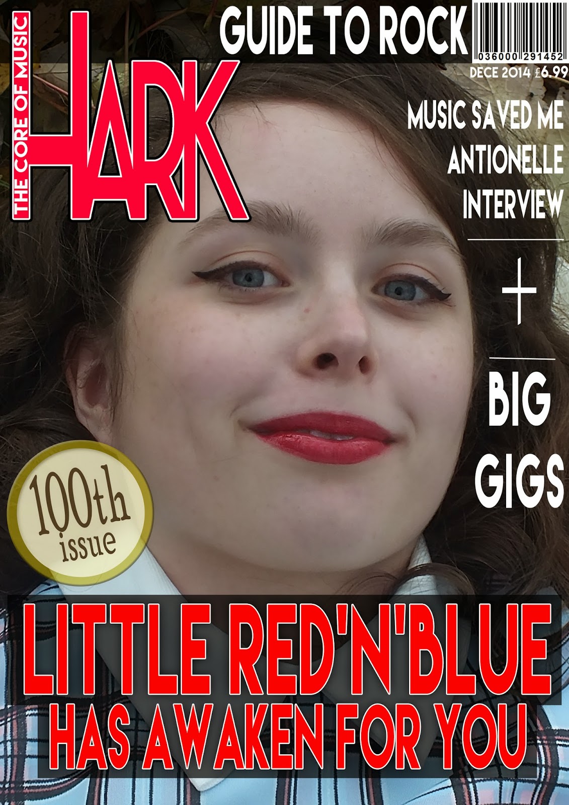
I tried to experiment with a few of the photos I took from my last post. I just thought of the first coverlines that came to mind and decided to call my cover star 'Little Red'n'Blue' or 'Little Blue' which can relate to 'Rock'n'Roll' or the 'Blues' rock.

I first made this cover, since I loved the rich colours of the leaved behind my cover star-I just hope it still fits my genre of rock; I felt that the use of red, black and white for the main cover line added a bit of attitude to the tone and the left-third masthead harmonizes with the autumnal colours-especially the red leaf acting like a bridge between the red masthead and the cover star's red lipstick; creating a strong symbiosis. I decided to turn the photo 90 degrees so she's portrait because it fit the A4 front cover better, I also like the odd sense of confusion it adds, as if she's waking up to some wonderland; hence the main coverline 'Little Red'n'Blue has awaken for you'. But I wonder if I could do a more 'square shaped' front cover so that those landscape photos can still fit well (sort of like the 'Little White Lies' film magazine size).
For the next few prototypes, I tried a few coverlines to frame the cover star and experimented with the colours a bit more. I kept the same coverlines throughout since right now I'm just experimenting with the layout


While I done these front cover prototypes, I kept in mind these previous blog posts to use as references, also to see my progress and how I could improve each time (for example, I've made the dates less specific in these ones, simply saying 'DEC 2014')
My NME Re-make Re-model tasks helped too, the first and second one.
I also kept in mind my typography and versions of my masthead
No comments:
Post a Comment