I absolutely ADORE this photo! I think it'll look brilliant either somewhere on the contents page or a double page spread. I found a red leaf amongst the yellow and brown ones, so thought that if I made the red leaf purposefully placed, it'd harmonize well with the red lipstick and perhaps the masthead of the magazine (if I chose it to be red)
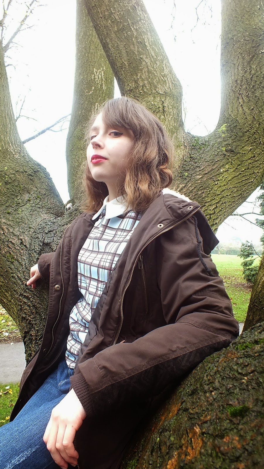
The two above are potential double page spreads, but I love the one just above! I searched for a tree which she could sit on and this one was one of a kind; it looked like a throne! So I tried to bring a sense of authority and majesty out of the cover-star's character, I decided she'd keep her coat on in these tree photos because the blue top may have clashed too much with the earthy environment if it was on its own.
As you can see, the above three photos I tried to bring out a sense of dominance from my cover-star's character, making her pose in a rather Queenly way and I love the camera angles, showing her as a whole in the long shot, to a low angle shot in the one above-giving her yet more authority,
I felt like doing a canted angle shot here, making it seem the cover star has a sort of unearthly power.
Again, I do love this very low angle, showing off the 'tree throne' to it's full extent, I wonder if this could be good for a potential contents page.
I love this photo, her pose and serious look in addition to her wearing a bow, makes her seem like some mythical creature, or a 'little madam' as my sister herself said. I told her to cross her legs slightly and bend her arms like that to add a sense of endearment and femininity.
Much like the one above, but I think this one will be great as a double page spread too!
The next few photos are all very similar, yet with the little adjustments of her expressions, just goes to show how important sublty can be to changing the cover-star's personality.
I know there's a lot of photos (I suppose I got excited and went crazy with loads of them) and it's going to be a hard job to narrow them down to 3-5 images, but I like to have a choice. Since this magazine is suppose to be a rock one, I think I'll pick the images with the most attitude (like the 'little madam' one.) I decided to go out into nature for this photoshoot not only because I wanted natural sunlight, and because the warm coloures are beautiful, but because the name of my magazine being 'HARK' can relate to listening, and nature is usually a quiet place where you can hear your own thoughts easily.


No comments:
Post a Comment