Saturday 29 November 2014

Drafting and Planning: Photos!

I've finished my photoshoot with my sister and I'm so happy with the way these photos turned out!!!


I absolutely ADORE this photo! I think it'll look brilliant either somewhere on the contents page or a double page spread. I found a red leaf amongst the yellow and brown ones, so thought that if I made the red leaf purposefully placed, it'd harmonize well with the red lipstick and perhaps the masthead of the magazine (if I chose it to be red)


The two above are potential double page spreads, but I love the one just above! I searched for a tree which she could sit on and this one was one of a kind; it looked like a throne! So I tried to bring a sense of authority and majesty out of the cover-star's character, I decided she'd keep her coat on in these tree photos because the blue top may have clashed too much with the earthy environment if it was on its own. 


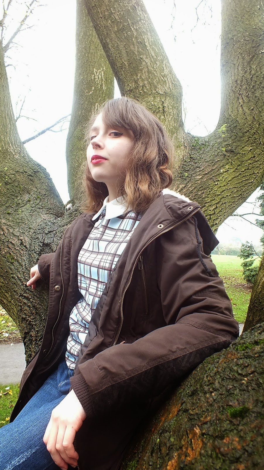
As you can see, the above three photos I tried to bring out a sense of dominance from my cover-star's character, making her pose in a rather Queenly way and I love the camera angles, showing her as a whole in the long shot, to a low angle shot in the one above-giving her yet more authority, 


I felt like doing a canted angle shot here, making it seem the cover star has a sort of   unearthly power.

Again, I do love this very low angle, showing off the 'tree throne' to it's full extent, I wonder if this could be good for a potential contents page.


I love this photo, her pose and serious look in addition to her wearing a bow, makes her seem like some mythical creature, or a 'little madam' as my sister herself said. I told her to cross her legs slightly and bend her arms like that to add a sense of endearment and femininity. 

Much like the one above, but I think this one will be great as a double page spread too!

The next few photos are all very similar, yet with the little adjustments of her expressions, just goes to show how important sublty can be to changing the cover-star's personality. 


I know there's a lot of photos (I suppose I got excited and went crazy with loads of them) and it's going to be a hard job to narrow them down to 3-5 images, but I like to have a choice. Since this magazine is suppose to be a rock one, I think I'll pick the images with the most attitude (like the 'little madam' one.) I decided to go out into nature for this photoshoot not only because I wanted natural sunlight, and because the warm coloures are beautiful, but because the name of my magazine being 'HARK' can relate to listening, and nature is usually a quiet place where you can hear your own thoughts easily. 


Organisation: Weather Report for photography

Today I'm planning on going out to take some photos of my sister in the park. I had another look at the weather and was pleasantly surprised to see some sun at around 10am:


I'm going to make her make-up similar to how it was in the last photoshoot, but I'll probably have to change my ideas on clothes, since I don't want her freezing to death. 
But this can be a very good thing. Since if I have her wearing a coat in some of her photos, I can put across how she's a 'normal girl' beneath it all, and so conforming to the social groups of normal teenagers, making her yet more relatable and, perhaps, inspirational in her ways that she doesn't need to physically show off in order to be great; her music speaks for her, not her appearance.
Her normal looking clothes could also give young people hope that you don't need to have had come from a rich background in order to do something great, merely determination and a passion for what you love. The natural environment around her would resemble her passion for music and, perhaps, her thirst for more imagination.
By her being with nature too, and not in a clean photography studio, can show how she isn't afraid to get her hands (or clothes) dirty, challenging the typical female artiste stereotype; obsessive of her appearance and keeping every hair in place etc. 

Thursday 27 November 2014

Organisation: Tracker Progress

I'm improving a lot on organisation, but I'm low on target audience.


So what I was advised to do was re-name and re-word some of the blog posts into 'Research into Target Audience' and I did just that with two of my 'Research into Similar Products' posts. So now, I guess I have 9 Similar Product posts and 5 Target Audience posts; there's a greater balance between my posts now!
When I get started on taking my photos and planning that more, I'll surely gain many, many more organisation posts. Through that, I can also create many more drafting and planning posts from experimenting with my photos and how to mould them into a magazine cover, contents page or double page spread. With the help of previous blog posts and my research so far (and gaining more research to come if I face problems in crafting my magazine cover) I can show a greater journey and sense of development in my own thinking as well as my creativity. Experimenting with Photoshop could give me more Drafting and Planning posts. But my lowest number of posts is on Target Audience; but I suppose I could get research from my audience through my research into similar products, since those music magazines must be doing something in order to get their audience's attention, and at the end of it, I still need to put my own sense of creativity and sometimes take a step back from audience research. Anyway, if you're following the crowd too much, you can't challenge conventions or make anything new!

I've still got a long way to go, and when I get my photos there'll be even more work to get done, so I only seek to improve and keep going so I could make my music magazine as great as possible. 

Wednesday 26 November 2014

Organisation: What Fonts to use within the magazine & Research into Similar Products

Organisation
I tried to take inspiration from most of the NME magazines, as well as adding a few quirks of my own. Some of these fonts I may or may not use, depending on what suits what best when it actually comes to putting the magazine together.

Fonts used:
Orial (subheading)
Arial (Cover lines and Main Cover line)
Desyrel (Some headings)
Poor Richard (Main body text, Contents list, Page numbers)
Vivaldi (the 'M' in 'Main body text' to be used when starting an article.)

Just like what I said in my previous typography posts (here and here), every font has their purpose and the fonts used must compliment the photos taken. Since I'm yet to take my photos, I'm unsure of what fonts would suit the images best. But I've got some idea of how I'd want the photos; set in a park, and the cover star though normal looking, has a 60's twist in her make-up. So the cover lines have to either compliment her quirky 60's side, or perhaps even conform to her serious 'normal', 'humble' side, or could even compliment the bold, powerful attitude of the magazine itself!

Research into Similar Products
Most music magazines use bold block fonts, and any switch in font type (especially in the front cover) would be to either highlight a pug or puff, to highlight exclusive cover lines, to show the important parts of the cover lines compared to other parts, or to highlight the main cover line in it's uniqueness according to the appeal of the photo. For example, this image of a Q front cover:


I love the different font uses here, but the most interesting use of fonts is the 'graffiti' like cover lines (relating to the graffiti background) and the bold font used for the numbers. The eye contact of the cover star looking towards the '50' could also help the audience move their eyes from the cover star and his story to the rest of the articles featured! But with the fonts, since they're varied in a purposeful, stylish way, it keeps the audience entertained and could show the variation of musical content inside!
So from having learnt from this, I'll try to not shy away from using interesting fonts, especially ones which compliment the cover star or the attitude I want to give off. For instance, if my cover star looks too 'girly' at some point, a dramatic font being used around her could change her whole appeal into something more dynamic. 

Tuesday 25 November 2014

Drafting and Planning: Masthead ideas

I used the base colours of red with a black outline, but I may follow the target audience feedback of harmonizing the masthead with the house style of the cover star if I could. I downloaded these fonts from 'Da Font' since my photoshop didn't have many fonts which I thought were effective enough- having already looked at my last typography post.

Fonts used are:
1) Lemon/Milk (top left)
2) Sansation (top centre)
3) Orial and Lemon/Milk (bottom left)
4) Alpaca Scarlett (bottom centre)
5) Aural (bottom right)

Keeping in mind the ethos of my magazine being a cool rock magazine (of all kinds of rock) I think my favourite is the fourth one (centre bottom), but I also love the bottom left and top centre one. These fonts weren't originally squashed together like this; I had to use photoshop to compress the individual letters together to give the overall masthead a greater sense of unity and can make it's positioning more to the 'left-third' of the magazine when I place it on the front cover.


Here's a version of my favourite four without a black outline. I think by it not having a dark outline, it allows the masthead to be part of the cover star photo; but I'll decide on this when I'm putting the magazine together. 

I think these are my official Mastheads, I'll pick which one and edit the colours depending on the photos:


Monday 24 November 2014

Research into Similar Products: Complex backgrounds

As I said in my previous post, I'd like to see whether a complex background would detract from the cover star and cover lines or add to it.


I like the countryside background to this Mumford & Sons photo, and it doesn't detract from the cover stars or the masthead at all. What they did instead was make the cover lines compliment the NME Masthead, with the use of black, red and white. But I wonder if this makes the symbiosis seem weaker because the diverse colour difference causes a split between the cover stars and NME. When I make my magazine, I'll make sure the photo has some sort of link with the masthead, for example, with a red masthead, there ought to be an element in the photo that's red, like the cover star wearing red lipstick. By doing this, there'll be a solid link between the cover star and magazine. Also, they have a sense of musical mise-en-scene with their instruments, so if I can't get my hands on an instrument, then I'll ave to make up for it by the cover star's attitude and appearance.


I also love the location they must've went to for this 'Killers' photoshoot. I like how the dirty, beige-brown rocks compliment the colour of the cover-stars' skin, and how their black clothes compliment the word 'BATTLE' and main body text. The background here adds a story and a dynamic that does not distract from the main story or the cover stars themselves. Since the colours of the background are similar to the colours of the Killers, a link between artiste and surrounding is provided, so isn't inconsistent in it's layout and with the help of their attitude and blocking (showing a sense of hierarchy/ acknowledgement of each band member's role), it makes the magazine still look like a music magazine, not an exploring/travel magazine,


I love the prominently warm coloures used in this main cover. What I also like is the distribution of the cover star and the cover lines and left-third masthead. We do see that the background is likely to be complex but this doesn't make the cover any less effective- actually, it looks much better than it probably would've if the background was white or some other plain colour. 
The golden tones of the cover star's skin matches the golden font of the main cover lines, and the small elements of white within his clothing also harmonizes with the white cover lines. The reds used relates well to the NME masthead; and so through this collaboration of colour, each matching either the cover star photo or the masthead, shows a strong symbiosis between them.

So with a complex background, I just need to make sure it fits in with the cover star and that cover lines can also still be read without any distraction. I'll definitely use these front covers and double page spread as inspiration for this idea!

Organisation: Weather for photoshoot

I was hoping to go to the local park to take photos of my sister in the sun. I suppose that was all wishful thinking since according to the BBC Weather, today, Monday, was the only sunny day of the week and Saturday will be foggy, like the rest of the week.


This is a bit of a pain, but I'm still going out there on Saturday, especially since I'm all enthusiastic for it! Besides, the temperature seems to be fine and even if it will be foggy (the weather forecasts can sometimes change) then it may change the tone of the article into a more solemn tone, or, if the cover star was to look happy, it could resemble being hopeful even when there's uncertain times ahead, etc. 

Even if this idea doesn't work, it's all to give me the right opportunity to get as many varied and effective photos as possible, whether it be inside or outside; and whichever sets of photos turn out best will be the ones I'll use. But I need to keep in mind the cohesion- If the front cover has a white background, then the other photos used will need to have a white background. If the background will be of nature or more colourful, then it must harmonize with the rest of the magazine with it's house style and must suit the ethos of the magazine itself.

Since I'll be going to a park, there's all sorts I could use to add more interest to the cover star. For example, she could sit on a tree or lie on the grass, and thankfully it's the season which leaves would be everywhere. The golden colours could be use of inspiration, perhaps the magazine could be an exclusive, or the '100th' issue, something to be celebrated.
With the use of nature, it could also resemble how the cover star's music is growing in popularity, just as nature grows. Either this or it could resemble her growing imagination/the beauty of her music and what fuels her creativity. I could mention in the double page spread article how nature inspires her for writing songs, so it's very relevant!

Sunday 23 November 2014

Research into Target Audience: Symbiosis between cover star and magazine

For my contents page, I'm thinking of using a few long shots to show the entire identity of my cover star. NME always seem to use the most tasteful, popular artists; even those who aren't new but have been around a while, such as David Bowie in this front cover:


I love the use of props here, the interaction between the cover star and an object, and the house style compliments the origami cranes so well too. I also find his facial expression quite amusing considering all he's doing is catching origami cranes. The fact he picks up the red crane links to the NME masthead and general house-style; this forms a strong symbiosis between the cover star and magazine company.


I love the simplicity of the house style and background, making it obvious that these are special editions by the gold and black house style as well as all the cover stars wearing similar coloures and all holding an old NME magazine, showing how NME has kept it's ethos throughout time. Again, I love their use of props and it's relevance to the main story, in addition to the various poses they're doing which, again, can hint to the article.
This makes me wonder if I should think about the article and create the photoshoot around the story, or take the photos first then create a main story around them. 


What I like about these two cover stars, even though they're both very different in terms of artists, they both have the use of a wind machine to add an effect of power and beauty. Their body language is also dependent on their personality, so I should keep in mind the personality of my cover star in order to bring the best out of her.

Q magazine is fairly similar to NME in terms of the layout of their front covers; they both tend to reach out to a similar target audience-those (probably young adults to people in their mid 30's) who don't have any specific music preference but love a varied magazine with great artists, all successful and shown in an idealistic, tasteful way.


I absolutely adore this page of Adele; it seems like it's a single page article, but it can still give me ideas on either a long shot for the contents page, or perhaps having the text wrap around the cover star in the double page spread! 


I love the pizazz use of of colour and even though the background is quite complicated, it doesn't take it away from the cover star. I love how the cover star's arm's gone through the 'Q', creating a strong symbiosis between cover star and magazine company. The house style and font types are also complimentary to the graffiti behind him. I suppose I must make sure the font compliments my photos too!
To be honest, now I'm stuck between whether I should have a white background, or if I should take the photoshoot outdoors into a sunny day in the park (if there's any chance of a sunny day this winter. But then again, weather may not matter, since if it was raining, then it could create a dramatic effect and maybe the article could be a sad one or it could represent the tone of her album.) because sometimes, like the Coldplay cover, the background can add to the cover star and the magazine, making it all the more dynamic. I suppose I just need to know the means and ways in which I can still effectively edit my photos so it blends in well with the masthead and cover lines-and I know photoshop will do the trick!

Thursday 20 November 2014

Organisation: How to approach the official photography

One thing I see I need to figure out with my photos is the background; I don't want the background to be too complicated or else it'll detract from the cover star and cover lines. The best approach I could have is to use a white background-which is easier to manipulate anyway-but I need to make sure the cohesion between the front page, contents page and double page spread is consistent in order to form a strong symbiosis between the magazine company and the cover star. In order to make this happen, font colours and types as well as cover lines and photos used have to be consistent. For example, its more effective if all the photos are from the same shoot; with this the sequence of front page, to contents to the double page spread will be mush more consistent and will help the message of the artist be more obvious and persuasive.

I like the idea of using a few long shots rather than mid shots all the time; especially since my cover star will be fairly vintage, her identity and personality could be strongly shown with a long shot. At the same time I need to make sure all the photos have some sort of correlation to a 'music artist' whether it be through props, clothing and make-up or the pose itself. Though she has a quirky yet modern identity already by her costume and make-up, to simply stand still would do her injustice, so an interesting pose- especially with a long shot-in accordance with her potential surroundings is the best way to proceed when it comes to photography.

From thinking about my last post, I mentioned the cover star having perhaps something unusual surrounding her to contrast with her quirky yet quite regular looks. So if I do have her in any interesting backgrounds, it ought to 'add' to her as an artiste, not divert the attention away. For example, I could use editing to change the background black and white if I feel it's too distracting, or it could become part of the house style and use a similar colour palette throughout. Shot types, like the long shot I mentioned before, could add more to her character, but so could low angle shots; giving her importance and dominion over her audience, making her seem powerful, and so reflecting her music's growing popularity. But I always need to keep in mind how I could arrange cover lines around the front cover photo, there needs to be a equal distribution of photo and text, to show a strong symbiosis between cover star and magazine. 

Wednesday 19 November 2014

Organisation: Inspiration for cover star and magazine style of music

With my photo exploration of the last post, I took inspiration from the 50's make-up, and acknowledged artists like Imelda May who has a 50's style with a modern twist to her; 


I tried to mimic the single curl in my cover star's hair, but it didn't work (her hair's very hard to discipline) so I just made the rest of her hair curly instead. I definitely incorporated the bold red lipstick and black eyeliner and the use of accessories; but I couldn't take total inspiration from Imelda May because she has a style and stature which is entirely different from my cover-star's.


When I done some research into the 50's and 60's fashion, I noticed my cover star in my photo experimentation looked a lot more like the 60's fashion than the 50's fashion:


60's fashion


50's fashion


So by discovering this, perhaps it'll be more 60's than 50's style of rock'n'roll music too! I could include classics in the charts list taking inspiration from artists like Elvis Presley, especially with his appeal and how he done a variety from typical rock'n'roll to ballads to gospel...


I'm completely inspired by how much of a performer he was with his talents touching all sorts of areas, and with a voice which could touch and melt any heart (yes, I'm a fan). I'm not surprised he turned out to be such a legend. It's that kind of attitude and appeal I wish to push through with my magazine; despite there'll be the sort of 'cute' 50's/60's make-up and fashion, there'll be that cool 'Elvis' appeal, again, reflecting on the style NME has; it may sound a little complicated, but I can pull this off by keeping in mind the house style of both the cover star and masthead (in order to get a strong symbiosis) and the shot types and any editing used as well as lighting.

But I think having a modern twist is very important too, since this is a rock magazine like NME which tries to be current and touch on many areas. So my cover star could look merely inspired by the 60's fashion (I think 60's is more achievable in terms of clothing) but have the relatable modern girl twist too; jeans and trainers, some casual clothing, so there'd be something comfortable and open about her. Through this I'd be touching on the social group of the 'normal' 'everyday' sort of person. Again, this makes her more relatable, but there'd be something special about her nonetheless. This could challenge the conventions of typical female artists who usually look half-nude and rebellious.

In this case, I ought to make the surroundings of her photos rather interesting then, so that if it's not her that's visually remarkable, then perhaps her surroundings could say something about music.
Most rock'n'roll songs seem to be about random things, such as 'Blue Suede Shoes' to something more expected like 'Don't be Cruel'. So the fact her appearance shows both extremes of normality and strangeness could reflect this genre's extremes of randomness and romanticism.

Tuesday 18 November 2014

Organisation: more photo and theme exprerimentation

Inspired by the 50's and 60's rock music and make-up make-up, I decided to take on this new theme for my magazine instead; especially since it comes out beautifully within my photos:


This one could be great for any of the pages, especially a contents page or perhaps a front cover!

This picture has to be my favourite; it shows great attitude and I love the lighting showing the colours at their best in this one!