Fonts used are:
1) Lemon/Milk (top left)
2) Sansation (top centre)
3) Orial and Lemon/Milk (bottom left)
4) Alpaca Scarlett (bottom centre)
5) Aural (bottom right)
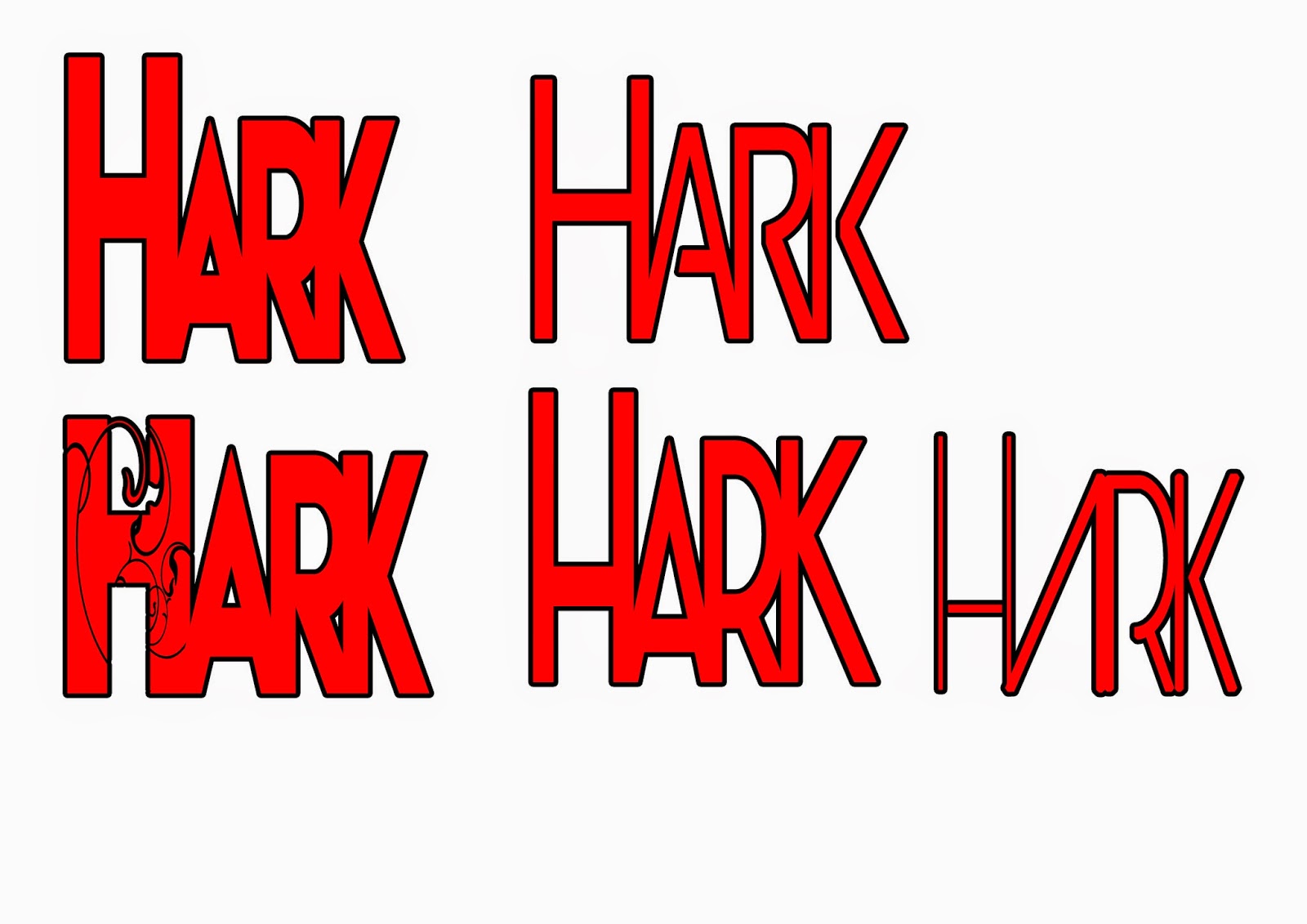
Keeping in mind the ethos of my magazine being a cool rock magazine (of all kinds of rock) I think my favourite is the fourth one (centre bottom), but I also love the bottom left and top centre one. These fonts weren't originally squashed together like this; I had to use photoshop to compress the individual letters together to give the overall masthead a greater sense of unity and can make it's positioning more to the 'left-third' of the magazine when I place it on the front cover.
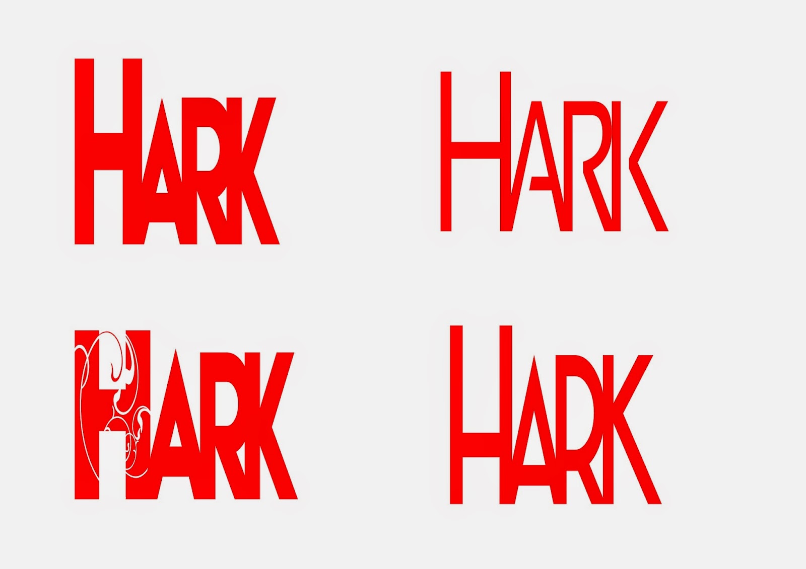
Here's a version of my favourite four without a black outline. I think by it not having a dark outline, it allows the masthead to be part of the cover star photo; but I'll decide on this when I'm putting the magazine together.
I think these are my official Mastheads, I'll pick which one and edit the colours depending on the photos:


No comments:
Post a Comment